Transforming the patient booking experience

Upgrading the visual and responsive experience

Overview

QuickMD is a telehealth platform dedicated to providing accessible care to services including urgent care, counseling, weight loss, and more.

Problem

In early 2024, we redesigned the booking flow for our native app to help make booking a visit easier for patients. This led to a disconnect between our native and web app in terms of experiences and visual elements.

So how can I improve the booking flow to be consistent and responsive?

For the purpose of this case study, I'd like to focus on only a few key screens and their changes.

Role and team

I was the lead designer for this feature and my focus was to make sure the content and layout for the booking flow screens are consistent with the mobile app, visually sound, and responsive.

These designs went through several rounds of iterations to deliver the high-fidelity designs by collaborating closely with my Design Manager and Senior UX Designer.

These designs are currently live.

Discovery

Our primary goal was to provide a consistent and responsive experience for the web app. By aiming for consistency, we can reach a broader audience of browser users and reinforce our brand.

High level strategy

Define our building blocks

We needed to define our breakpoints and utilize the high level layouts that was decided on prior.

Start with our native app

As a starting point for consistency, the native app is used as a reference for what screens are needed since the web booking flow has a slightly different flow and visuals.

Take advantage of this opportunity

If there are any longstanding improvements we've been waiting to do, let's select the ones that enhance the experience.
Competitor inspiration

Competitor analysis

I looked at various primary and secondary competitors including Vetster, Zocdoc, MyChart, and Teladoc to see what kind of responsive patterns they were doing.

Some common patterns include:

Content reflows

As screens get bigger, certain sections or elements will rearrange themselves to allow content to scale.

Stretch until max width

The content margins would continually grow up until a certain point.  

Home

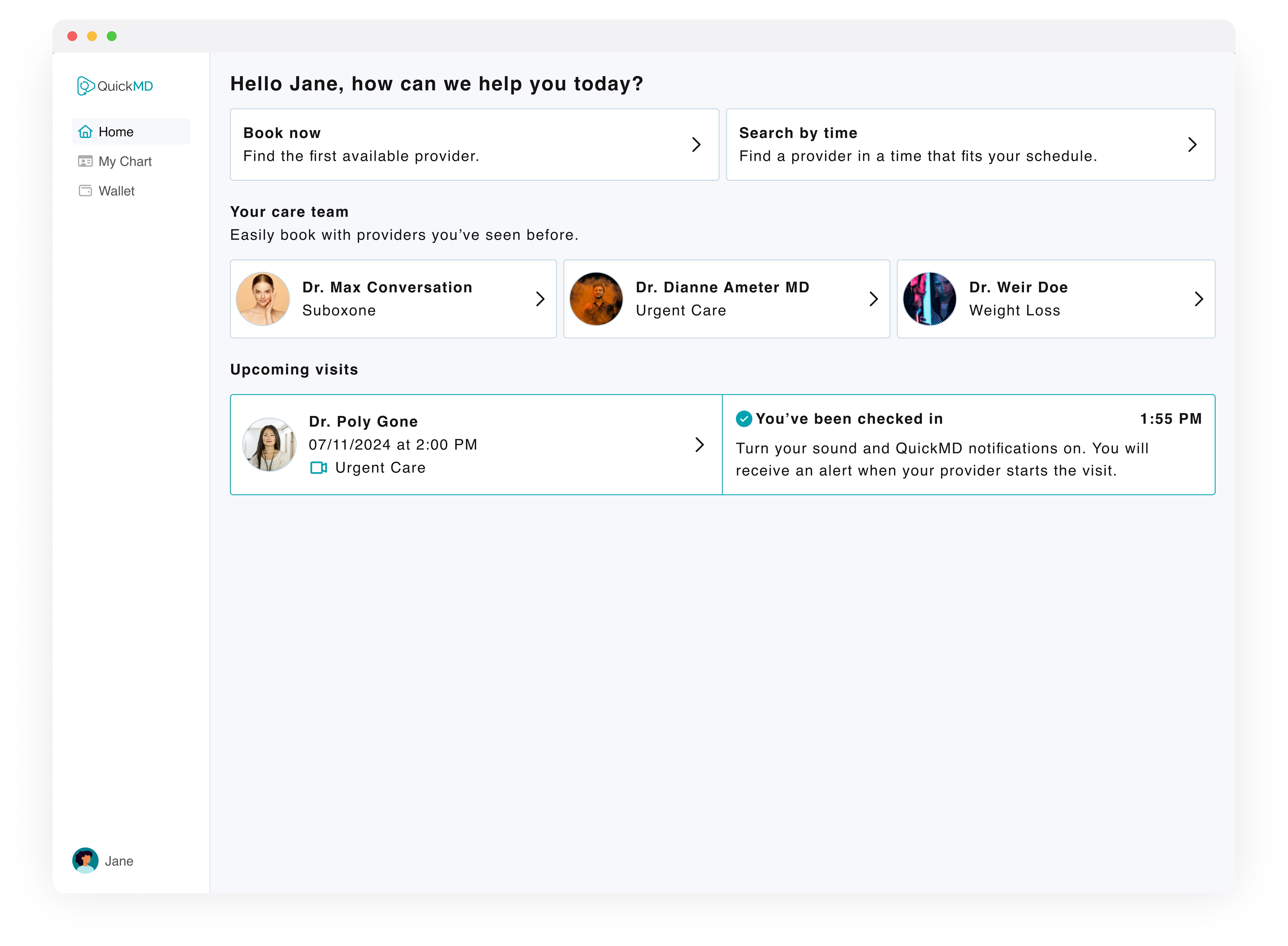
The original design gives an entirely different visual experience from the native app and has different kinds of content presented.

Stretching content

At the small breakpoint, the screen strongly resembles the native app. As the screen gets larger, the content stretches until it can reflow until it hits a max width.
Original home screen
New responsive home screen

Visit card

The original visit card design for both the native and web app has visit details on the top and visit updates on the bottom. If a visit update had a lot text, the text would just fill the container, posing readability issues.

Readability in mind

We kept the original vertical structure for the cards since it works for smaller breakpoints.

At the medium breakpoint, the visit cards will go from having a vertical layout to a horizontal one. The visit details will stay on the right while the visit update and button will shift to the left.

Cleaning up

By removing unnecessary elements and updating the layout slightly, the card was cleaned up to reduce noise and utilize space wisely.
Original visit card
New responsive visit card

Payment methods

The original design consisted of a popup that would appear when a user needs to put in a payment method. To select an existing method, a user needs to select the text button then exit to pay and book.

Improved clarity

By using radio buttons for selecting a payment method, it's clear to users which card is selected.

Parred down

The cards had extra details like an ellipsis placeholder and a two lines for the card number and expiration date.

While this is all important information, I reduced cleaned up the card it to contain what's necessary to help reduce cognitive load and save space.

Empowering users

I wanted to empower users on how to help themselves because it's not always clear what actions you can do in the original screen.

So for any reason users need to delete a card, I added a blurb to give users directions on where to go.
Original payment methods screen
New responsive payment methods screen

Success

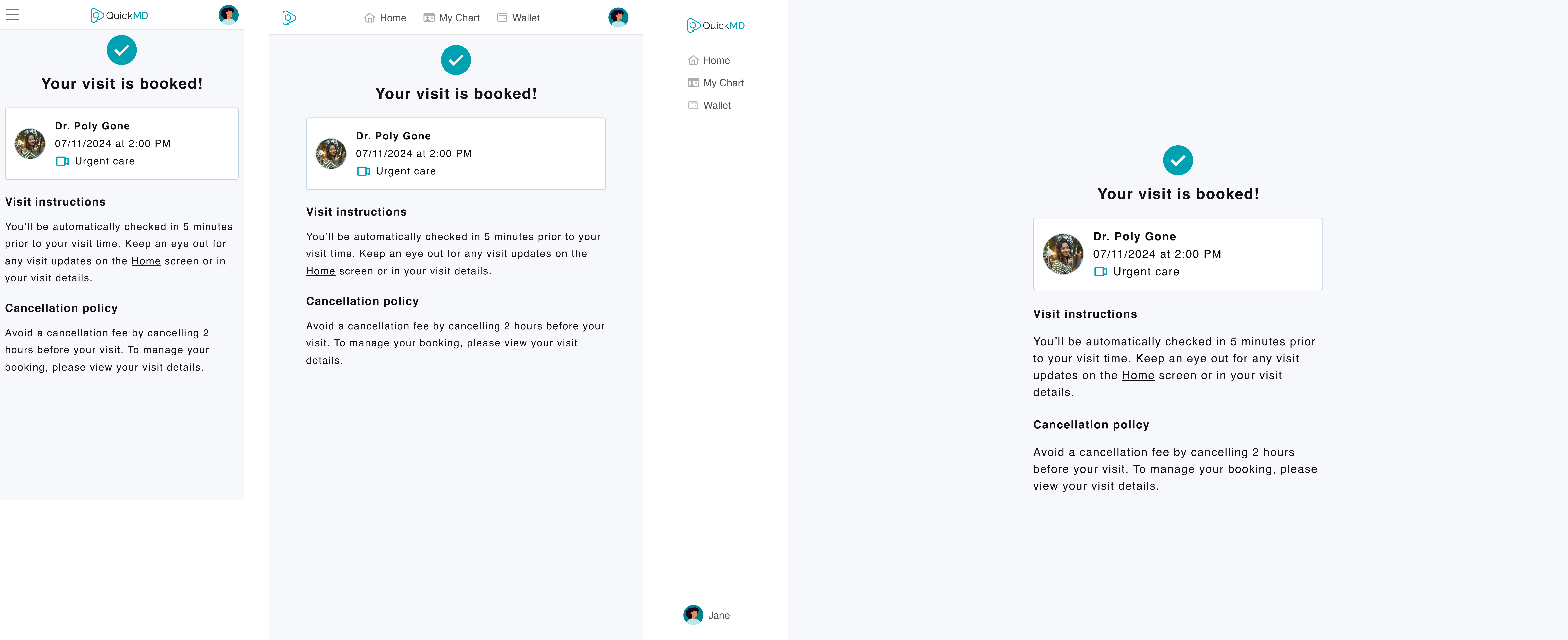
One new screen I'm especially happy we added is this success screen that comes after a user pays and books for their visit.

We didn't have one before, but I often wondered why since this would benefit both new and returning users by having a few key aspects.

Visible status

Users know right away what was the status of their booking.

Friendly reminders

Providing a snippet of their visit instructions and the cancellation policy reduces confusion and sets expectations.

Opportunity to download app

Having this success screen also gives us the opportunity to convert our web users into mobile users for a more convenient experience.
New success screen

Final thoughts

If I could do this feature over again, I would've been more strategic with changes.

I would've skipped the small aesthetic changes like the updates to the payment method because these small changes end up adding up. At the end of this, one piece of feedback we got was we introduced additional changes that weren’t accounted for and that caused confusion across teams.

Even if it was cleared by my manager, I would talk to my PM about it still to see if it was worth pursuing rather them knowing at the end.

Lastly, I would advocate for a "trial" responsive feature. Rather than make an entire flow responsive, I would've started out with the home screen and get both Design, PM, and Dev feedback before jumping into many others.

While this was a chaotic feature to work on, I successfully passed on web mockups for the entire booking flow.

Catch me in the wild

Resume

Email

LinkedIn